Choosing Colors for Upscale Plaid


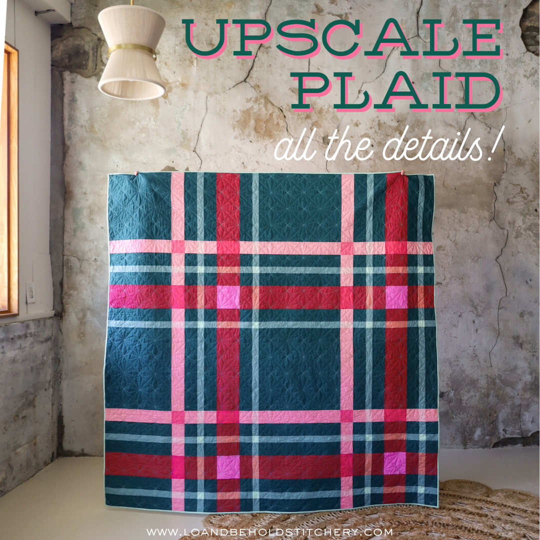
Upscale Plaid uses color to create the illusion that the stripes blend where they intersect, pretty fun right?! Color choices are key in creating this effect so let’s talk through some helpful tips to get you started.

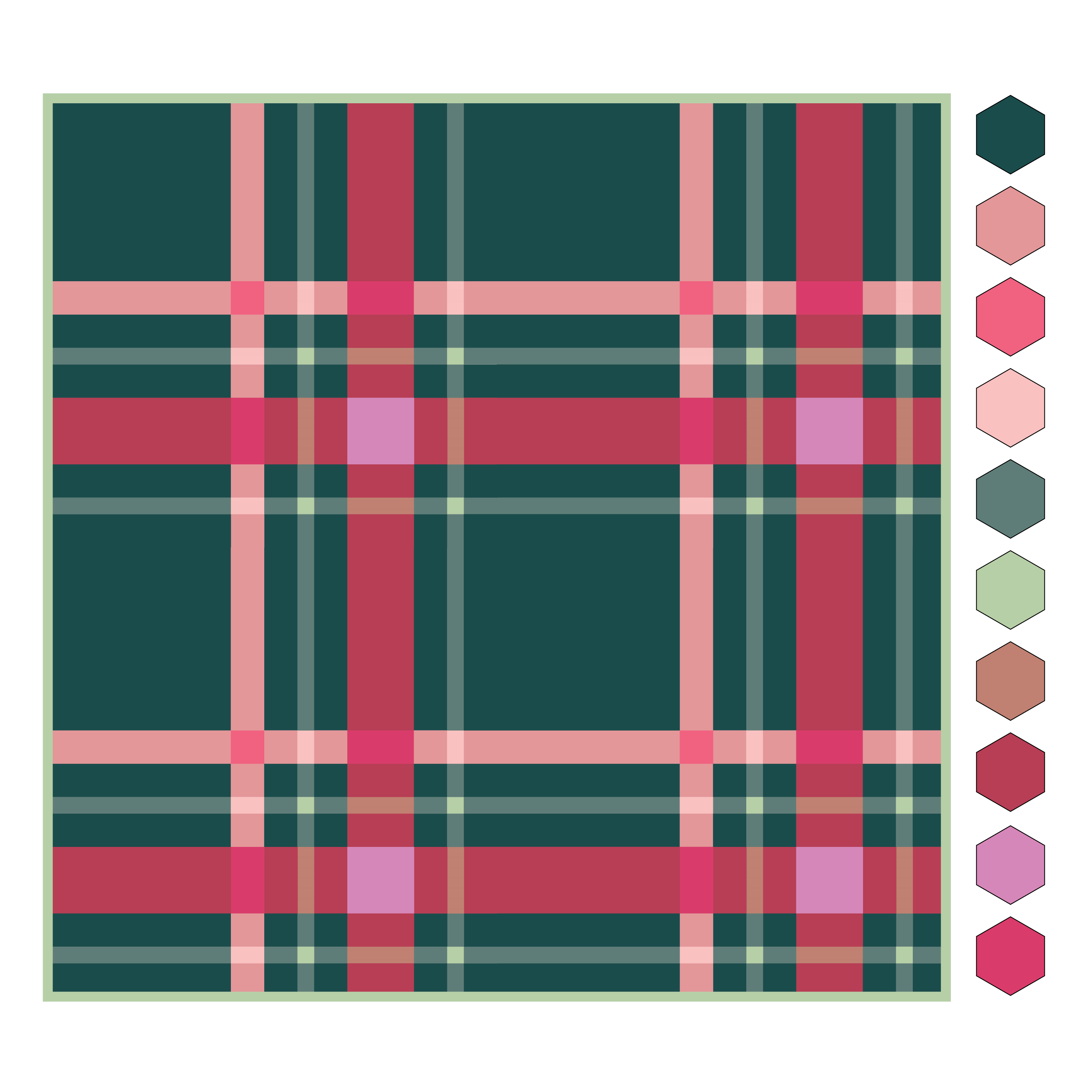
Upscale Plaid’s design is made up of 10 colors:
- Background - this is the predominant color of the quilt and it sets the stage for the design. We used a rich jewel tone of blue/green for the cover quilt.
- A1 - A3 – The A stripes are the medium width stripes of the quilt and likely what you’ll notice after seeing the C stripe. Choose a color for A1 that pairs well with C1 as they co-star in this design. For the cover quilt we chose pink, a lighter version of the red color for C1.
- B1 - B3 – Accent Stripes – The “B” stripes are the smallest stripes and play a supporting (yet still important!) role in Upscale Plaid’s design. Choose a color for B1 that coordinates with the Background, A1, and C1, but, one that doesn’t steal their spotlight. In the Cover quilt we used a lighter, more subtle shade of the Background color. It's noticeable but in a quieter way than the rest of the colors.
- C1 – C3 – The “C” stripes are the widest stripes and where your eye will be drawn first. They have the lead role in this design and add high impact. C1's color should coordinate well with the Background and A1 stripe. For C1 we chose a rich vibrant red, its a complimentary color to the Background and plays well with the other colors in the quilt.
Now that we've introduced the colors, lets get started in choosing fabrics!

Background (BG), A1, B1 & C1
Do you already have an idea of the colors you would like to use in your quilt? If yes – go ahead and choose your colors for the Background, A1, B1 and C1 first.
Not decided yet? No worries! Here are a few questions to get ideas flowing:
- Who is this quilt for? What are their favorite colors?
- What is your inspiration for the quilt? Pinterest is great for gathering ideas and photos, click here for some color inspiration we've put together.
- What room will the quilt be displayed? What is the color scheme in the room?
- What look would you like to achieve for your quilt? Would you like it to feel: earthy, classic, bright, playful, neutral, soft, calming, monotone, energetic or something else?
- Do you prefer a quilt that is high or low contrast?
Based on your answers above, decide on your colors for the Background, A1, B1, and C1.
By the way, we've included a "Plan Your Quilt" sheet and Fabric labels in the pattern to help keep your project organized. Its a great way to keep track of the details!

A2, B2, C2
Now that you have the BG, A1, B1 and C1 selected, next choose your colors for A2, B2 and C2. Before deciding though, notice how each set of stripes blend together where they intersect? This is what creates the illusion that the stripes are woven together.

We have created an easy to use formula for selecting the intersecting colors, where "adding" two colors together equals a new color. It may help to imagine what you get when you mix/stir paint colors together!
"Add" each color (A1, B1, C1) to itself and then choose a darker or lighter shade in the same color family to give you A2, B2, C2. In reality adding the same color together would give you the same or a darker color but for our "quilty" purposes you can choose darker or lighter colors for A2, B2 and C2.
A1 + A1 = A2
B1 + B1 = B2
C1 + C1 = C2

A2, B2, C2 Quick Tip: Add a pop of color and a fun twist to your quilt by using a color for A2, B2, and/or C2 that doesn’t follow the above formula, you will still have the illusion of "plaid". In the example above, B1 + B1 (Toasty Walnut) would not equal any shade of blue, BUT, it adds a hint of cool that offsets the warmer colors that we just love!
A3, B3, C3

The last group of colors you'll want to choose are A3, B3 and C3. For this group, again notice how each set of stripes blend together where they intersect. Because two different colored stripes are intersecting here (instead of the same color as we saw with A1, B1 and C1), they produce a third color that is a combination of the two. Its important in achieving the woven effect that A3, B3 and C3 be a combination of the two colors they intersect and also be of a similar value. This group of colors are typically more subdued. In our examples above, for A3 we went a little lighter than A1 while keeping it similar; for B3 because red and green mixed together make brown we went with a subtle shade that has red undertones; and for C3 we went with a value and color that is in between A1 and C1.
A1 + B1 = A3
B1 + C1 = B3
A1 + C1 = C3
IMPORTANT: Its important to follow this formula when choosing the colors for A3, B3, and C3. If the colors contrast too much or are too different here it will “break” the illusion; the stripes will lose their structure and instead appear as individual blocks.
Put all the colors together and you have Upscale Plaid!
Here are a few colorway ideas to get you started:

USING PRINTS WTIH UPSCALE PLAID

Ruby Star Society Speckled in: Pale Pink, White Gold, Earth and Wine Time; Robert Kaufman KONA solids in: Rose, Deep Rose, Plum, Melon, Honeysuckle and Med. Pink.
Using Prints
Upscale Plaid also works well with prints and blender fabrics and is a great way to add a bit of texture and movement to your design!

Mock up 1: Art Gallery Fabrics: PRINTS: Florence Collection by Katarina Roccella - Primavera all'Alba, Damasco in Rosaceo, Damasco in Terracotta. PURE Solids - Sweet Macademia, Miami Sunset, Light Grey, Spruce, Nocturnal, Sugar Plum, Crystal Pink.
Mock up 2: Art Gallery Fabrics: PRINTS: Florence Collection by Katarina Roccella - Primavera al Tramonto, Damasco in Rosaceo, Bargello Panna, Damasco in Terracotta. PURE Solids - Miami Sunset, Light Grey, Pacific, Nocturnal, Monet, Peach Sherbet.
TIPS FOR WORKING WITH PRINTS:
1. Blender prints typically have ample background space with a small repeating motif in one or two colors. Because blenders read as a solid they are a great option to add a little texture.
.
2. Small to medium scale prints with a heavier density are another great option as they add ample texture and movement.
.
3. Non-directional, repeating patterns work best.
.
4. Consider using 1-4 prints and solids for the remaining colors. Prints can add quite a bit of texture and movement which works best when there are also solids included to balance them out. The first mockup below uses only 1 high impact print for the background but notice how much movement it creates!

Mockup 1: Art Gallery Fabrics: PRINTS: Duval by Suzy Quilts - Boho Birds Truffle; PURE Solids: Velvet, Weathered Brick, Thistle, Mauvelous, Bougainvillea, Cotton Candy, Pearl, Snapdragon, Sugar Plum.
Mockup 2: Art Gallery Fabrics: PRINTS: Duval by Suzy Quilts - Blocks Haze, Tiny Moon Pearl, Basket Weave Shrimpy; PURE Solids: Driftwood, Haze, Thistle, Raw Gold, Creme de la Creme, Ginger, Sugar Plum.
Fabric Requirements
We're so excited to share that there are SEVEN different sizes included within Upscale Plaid. The Lap, Throw, Queen and King all have 5 different layout options included within the pattern. There are so many possibilities with this pattern!

Testing Colorways
Now that you have some ideas to try out, play with different color combinations to see what you like best!
We’re happy to share that we’ve again partnered with PreQuilt to bring you free online interactive coloring pages. These make it really easy to test out many different fabric color combinations quickly! Digitally plan this quilt and a few other Lo & Behold designs (we're working on getting more uploaded!) with the click of a button. They have a really great free option that allows you to use different brands of solids; or you can upgrade your plan to use prints, save your designs and more! Use the code LOANDBEHOLD for 20% off your annual subscription (either Basic or Market)!
Have fun playing with color and be sure to share! We love seeing what you create! Tag us at #upscaleplaidquilt #loandbeholdpatterns and @loandbeholdstitchery .
Happy Quilting!
Have a question? We're here to help! Email us at hello@loandbeholdstitchery.com .


