Retro Blossoms quilt - the Hemlock version

I'm back to share about a brand new Retro Blossoms quilt! If you missed it, Retro Blossoms in our latest quilt pattern, found in our shop here.

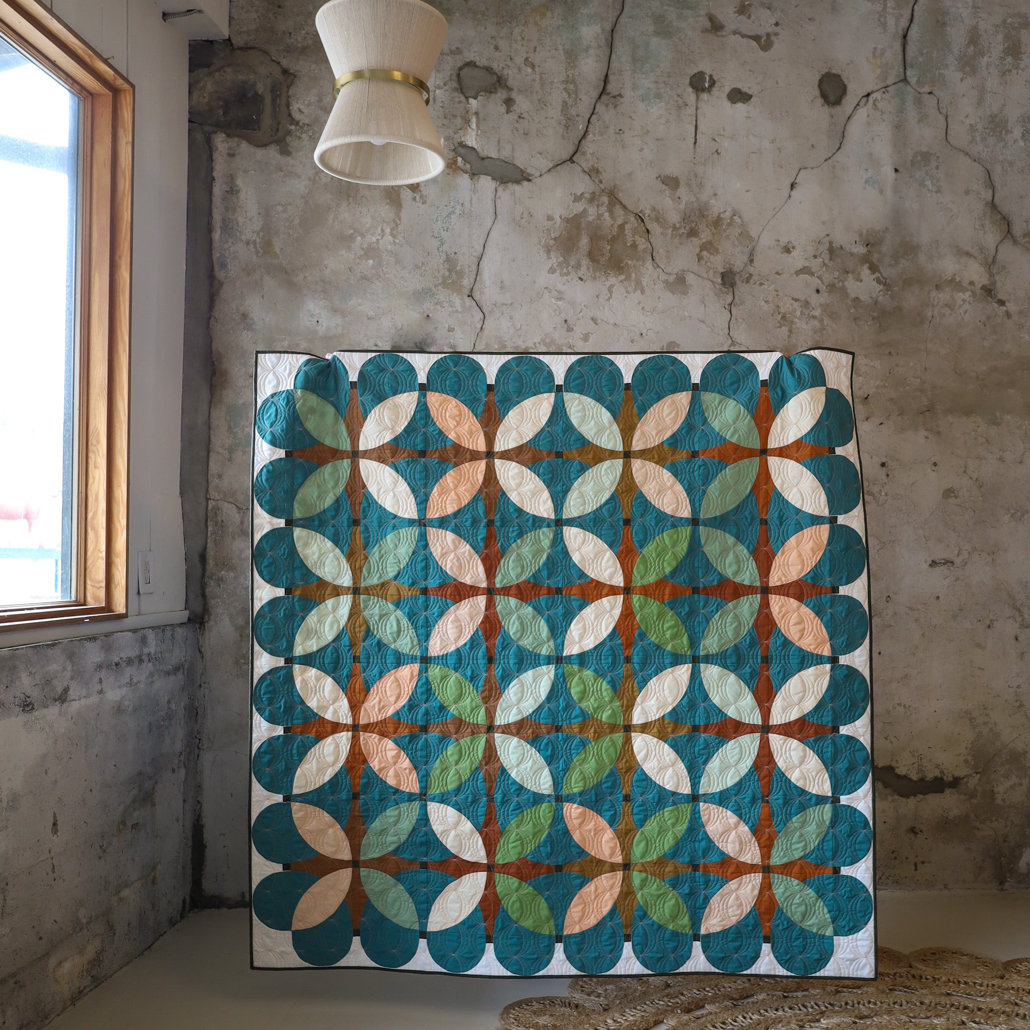
I tend to make a "warm" and "cool" sample of each of my quilt patterns. The cover quilt falls in the warm category (which you can read about here) and this quilt definitely feels a little more cool. I've talked about this before, but I don't typically gravitate towards greens and teals. And if I do sew with green, I prefer a very specific tone/shade... like this Nightingale quilt using AGF Forest Night as a background. (swoon!)

For this quilt, I used one of Art Gallery Fabrics' new solids (by Suzy Quilts) called Hemlock for the background. It's a mix between a teal and hunter green that I find so beautiful and almost chameleon-like.
Have you ever noticed how colors can change when their paired with other colors? On it's own, Hemlock looks way more green in real life, but once it's paired with other shades of true greens, it seems to lean more blue. It's fascinating what happens once it's all sewn together!
Here's a look at the fabrics used in this quilt. I love the pop of peach thrown in and how it warms up the palette just a smidge.

.
All fabrics are Art Gallery PURE Solids:
- Orange Peels:
- 1/4 yard or FQs of Shrimpy, Asparagus, Pistachio and Ginger
- 1/2 yards of Pearl and Matcha
- Background:
- Hemlock
- Accent:
- Teak
- Gingerbread
- Golden Bronze
- English Toffee
- Cornerstones:
- Forest Night
- Border:
- Snow
We have kits for this exact quilt in the shop!
We're also super excited to offer acrylic templates as well! This pattern uses three different kinds of curves, so there are 6 total templates. The PDF and paper copy includes those templates, but if you'd like something a little more sturdy that you can use over and over again...definitely check out the acrylic!


Overall, this quilt has a little bit of a different feel than the cover quilt. We dive into color theory for this quilt inside of Curve College but you can definitely get a taste of what I mean when you play around with this quilt via the digital coloring pages on PreQuilt. In a nutshell, it's important to think about the "value" of your fabrics, or the relative lightness and darkness of the shade. This value is what really stands out as "contrast" in your quilt.

In this Hemlock sample, my Accent fabrics (golden browns) are of a similar value as my Background fabric (teal). This causes my Orange Peel" fabrics (greens and peaches) to really pop out to the forefront of the quilt, making them the focal point of the entire design.
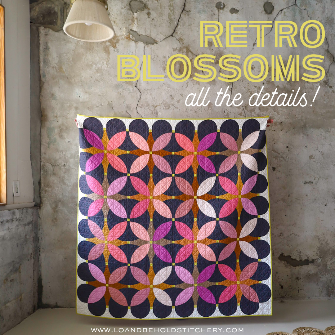
In the Cover sample, seen here, the Accent fabrics are a similar value as the orange peels. They're different shades of color, but the values are similar, making them read similarly within the design. Notice how these two samples look slightly different because of that? Pretty cool, isn't it?
I made the Square Throw size of this pattern, so it measures 61" x 61". I decided to send it off to Ashley of Henhouse Quilting for longarm quilting. I quilted the cover quilt myself, which is also the same size, and 61" square is just on the cusp of my personal maximum DIY quilting size, haha. So it was nice to send this one off!


We went with a pantograph called "Pearl" by Leisha Farnsworth, which was a nice compliment to the curvy shapes in the pattern. The thread is a light peach to match the peach fabric in the quilt and I LOVE that extra addition of color to the quilt!


For the binding, I matched the Cornerstone fabric (AGF Forest Night) and I love the frame that it gives for the entire quilt! I used a Pearl Cotton 8 weight thread for a "big stitch" binding. I opted for a peach color to match the quilting thread. The backing is an AGF print by Katarina Roccella called Blossoming Nebule. We have kits that include backing and binding fabric in the shop as well!

I hope you love this quilt as much as I do. It was such a fun make! Thanks for reading!
Happy Quilting!
.
LINKS:


