Deco - the Cover Quilt!

In case you missed it, the Deco Quilt pattern is now available!
If you haven't already read my initial blog post about the two-color Deco quilt that I made, be sure to check that out here. You'll find my inspiration, pattern sizes fabric requirements and other details about Deco.
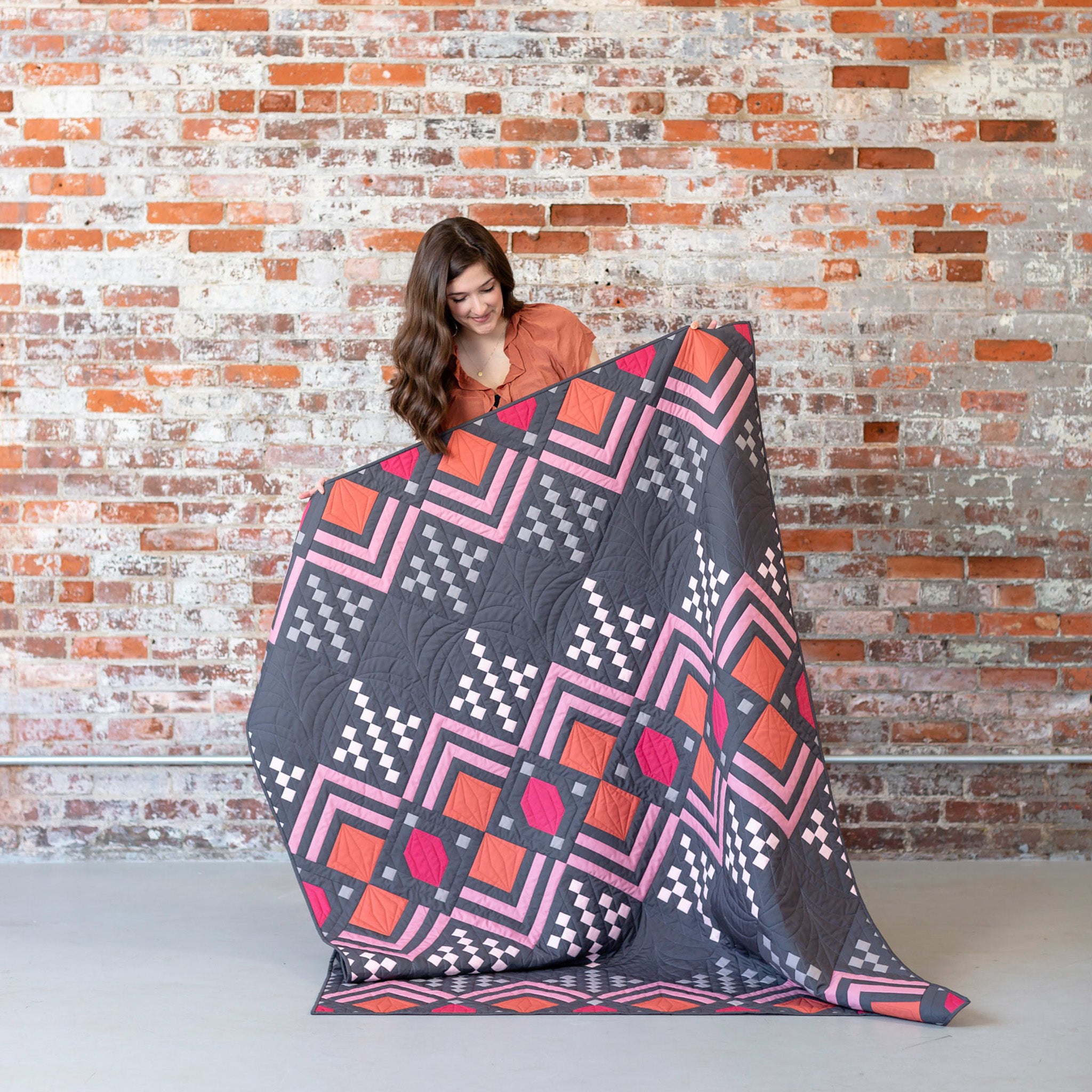
Okay! My last Deco quilt to share with you is quite possibly my favorite one! This was my last Deco quilt to design....mostly because I was really held up by choosing colors! I initially thought that I had my colors nailed down, then I got about halfway through sewing all of my blocks and I HATED it. It was nothing like what I envisioned in my head! I loved all of the colors individually, but they did not work well together at all. I was in a little bit of a time crunch, so I was really bummed that I changed my mind. I actually wasted a whole day contemplating whether or not I should start over. In the end, the colors weren't sitting well with me, so I decided to start over! Thankfully, I used my Kona color chips to find other fabrics, and I ordered some fabrics online with expedited shipping. Once they arrived, I was still a little bit skeptical that it would turn out how I wanted, but I jumped in and hoped for the best!

.
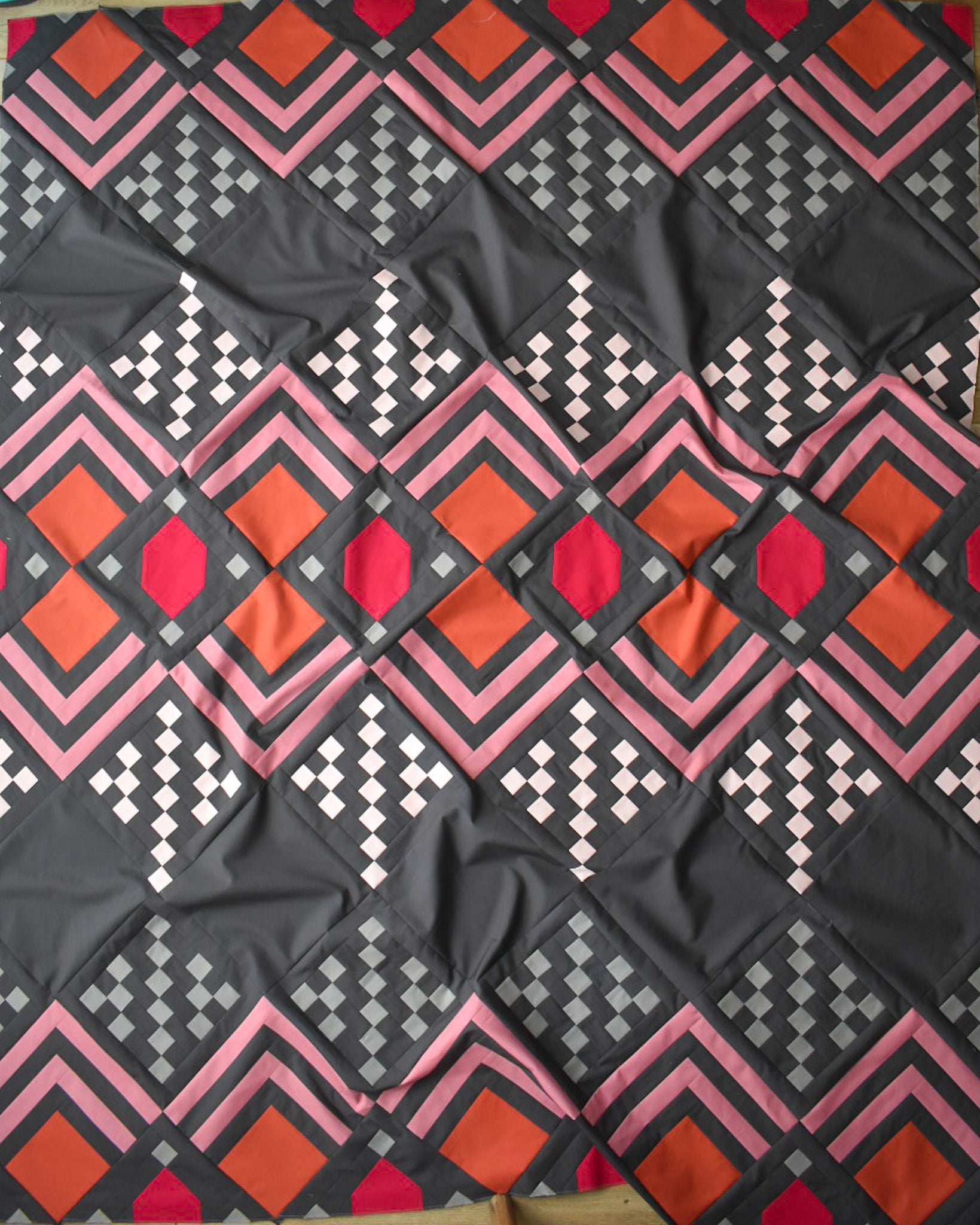
From top to bottom, the fabrics are: Magnetism, Smoke, Bellini, Rose, Deep Rose, Sienna. This is how I used them in this quilt:
- Color 1: Sienna - 1/2 yard
- Color 2: Deep Rose - 1/3 yard
- Color 3: Rose - 3/4 yard
- Color 4: Bellini - 1/2 yard
- Color 5: Smoke - 1/2 yard
- Background: Art Gallery Fabrics Magnetism - 3.25 yards
We have quilt kits to create this exact quilt in our shop!
I sometimes like to stick with only one fabric manufacturer per quilt, especially if I know that it's going to be on the cover of a pattern. But since I originally thought that I was going to use all Art Gallery Fabrics for the quilt, I kind of had my heart set on using AGF Magnetism for the Background. When the AGF colors didn't work out and I had to make the switch to Kona, I decided to keep the Magnetism background because it just felt right. I would say a comparable Kona option would be Gotham Grey...but it's slightly more "cool" than Magnetism. The hand of both of these fabrics is slightly different. Kona is a little more weighty, slightly thicker and a little more coarse to touch. But overall, once everything was stitched together, it's VERY hard to notice that they are two different brands of solids. If anything, I think it adds some character and interest!
After I started creating a few blocks, I slowly but surely started getting really excited for the outcome!

.
Once all of my blocks were done, I sewed them all together in record time! I think my nerves gave me an extra boost of energy, as I was just really excited to see how it looked! One thing that I discovered with this quilt is that each fabric really looks different on it's own than it does collectively with the other fabrics. You can see how all of the fabrics sort of reverberate off of each other giving off a collective vibe, which I think is really fun and kind of unique.

.

.
From the beginning, I knew that I wanted to send this quilt to Andrea of Walker Quilt Co. for custom quilting. She has custom quilted (and edge-to-edge quilted) many of my quilts before! You might remember her custom quilting on my Church Window, Retro Ornaments and Metamorphosis quilts! Andrea does AMAZING work! She sent me over an idea for this quilt and I said "go for it!" I love that she used the negative space in the quilt to create another art deco motif. And it's perfectly executed too! She also did a little bit of "stitch in the ditch" too, which really highlights certain elements of the blocks. I love how this adds extra "fluff" to the Color 3 strips in the quilt!

.

.
For the backing, I used Burgeon Forth by Sharon Holland for her Kismet collection. I love it! And for the binding, I used Magnetism to match the background of the quilt. It gives the quilt a really nice framing, which I like!
I did big-stitch binding for this quilt to add a little handmade touch. I normally like to machine stitch my binding onto the front of my quilt, then flip the binding over and machine stitch on the back as well. This makes it so that there are visible stitches on the front of the quilt, which I typically don't mind...but for this quilt I wanted those stitches to be hidden.
The colors in this quilt are kind of tricky to photograph (at least for me). My camera kept wanted to over correct some of the colors, and since they all kind of play off of each other, it can make a really big difference in how the quilt appears. Thankfully, my photographer Brittany, knows what she's doing!

.

.

.

.

.

.

.
The location where we took these photos is often used as a wedding venue. They had this gorgeous pink velvet chair in one of the dressing rooms. Doesn't it match perfectly with this quilt??

.

.
 .
.
 .
.
 .
.
 .
.
I hope that ya'll love this pattern as much as I do! Remember that today is the last day to purchase all of my patterns at 15% off! It's also the last day to make a purchase that will go towards the Danita's Children NICU fund. As of right now we've raised over $1,400!
.
LINKS:
- Deco Quilt Pattern - DIGITAL
- Deco Quilt Pattern - PAPER
- Blog Post - the original Deco quilt
- Blog Post - the Ivory Deco quilt
- Blog Post - the Baby Deco quilt
- Blog Post - Tester Deco quilts & Mock Ups
- Quilt Kits


