"Fern Garden" Celtic Crossing Quilt

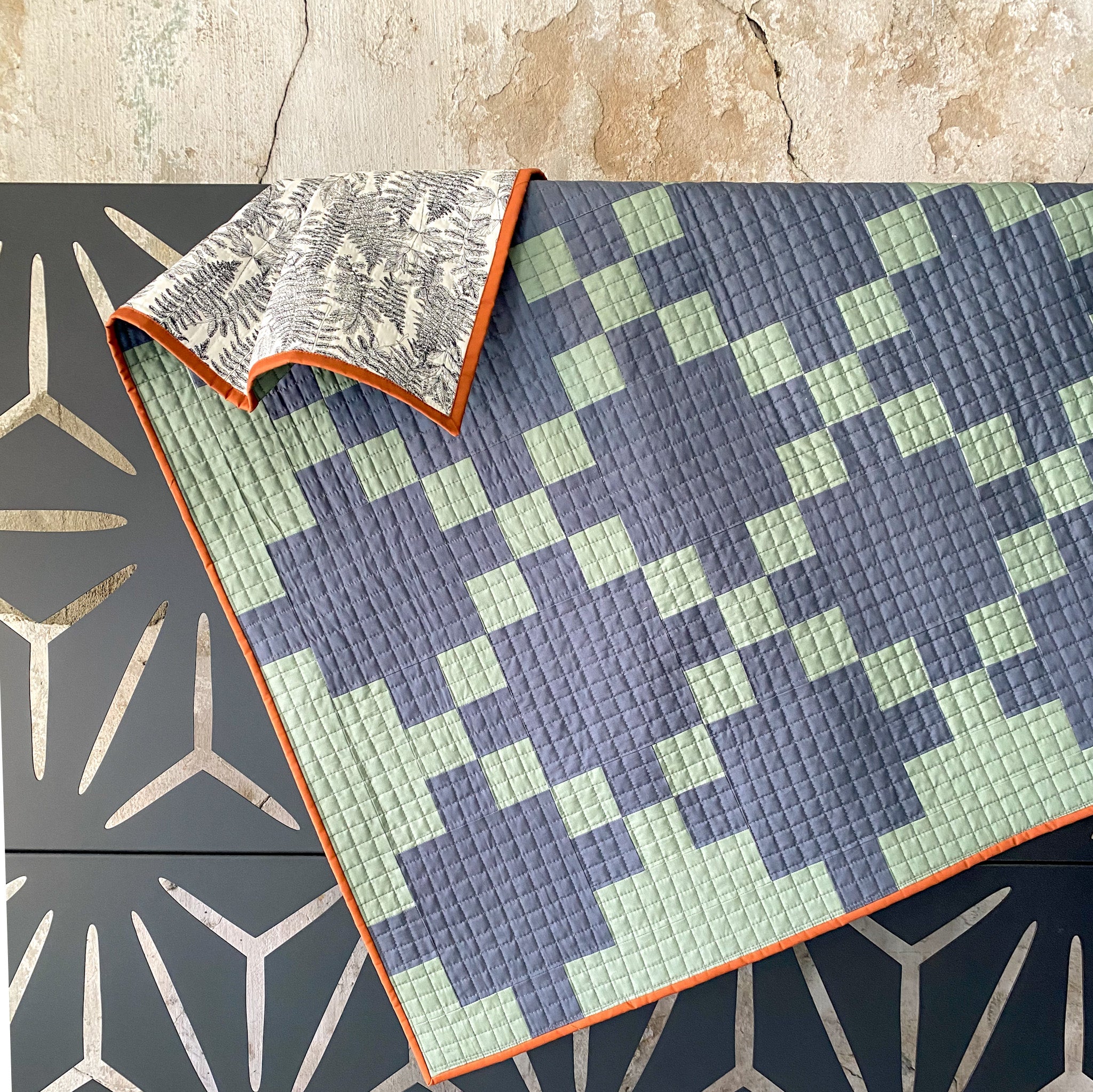
Hello there! I'm back to share about another quilt that I recently finished; I'm calling it my "Fern Garden" Celtic Crossing quilt. You'll see why in a second. :) But ever since I made my 2023 Kona Color of the Year Knitted Star quilt, I've been really gravitating towards quilts that have similar value fabrics. In the quilting world "value" refers to the relative lightness and darkness of a fabric. And the key word is relative because it's all about the fabrics that you are comparing. So I sometimes like to think of this terms of contrast. So a black and white quilt would be very high contrast, but with my Kona Knitted Star quilt, and with this quilt that I'm sharing about today, the two fabrics in the quilt top have similar relative values. And for some reason, I've really been loving this creative approach!

.
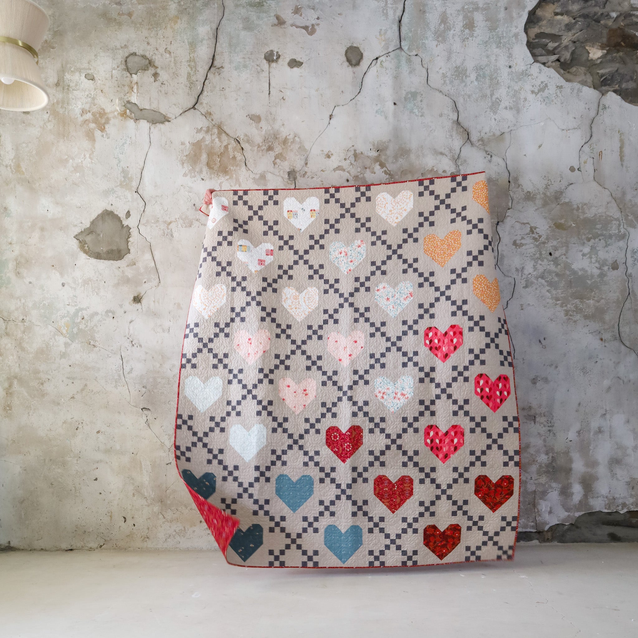
A few months ago, I started thinking about our next Beginner Quilting Academy launch (which happened a few weeks ago!) and I knew that I wanted to add in a few extra course updates. Inside BQA, we create the Modern version of the Celtic Crossing 2.0 pattern. One of the updates that was high on my list was to add a two-color "Traditional" option to the course. To do that, I needed to make a sample and I knew that I wanted it to be with some of Art Gallery Fabrics new PURE solids. I mean, just look at this group! The purple (Bougainvillea) was REALLY calling my name. It's like a mix between a hot pink and Barney purple (haha) but it really is so gorgeous in real life!
By the way, this is Art Gallery's latest release of new PURE solids...we have half yard bundles in the shop!

Like I said, my initial idea was to use Bougainvillea and Cosmos, because aren't those shades just the prettiest?? But I have a few upcoming projects with purple in them and even though it's my favorite color, I wanted to go a different direction. So I thought maybe I could still use one of the purple-y pink shades and combine it with Slate. Here's what those ideas looked like....

From top to bottom, they're AGF Slate and Crystal, Cosmos, Rock Candy and Bougainvillea. I really love seeing the Background and Foreground switched between all of these. I would say out of all of these mock-ups, the last one was my favorite. But again with the purple, I felt like I needed to broaden my horizons a bit.
So then I entertained the ideas of AGF Slate and Balsam Fir. I loved how the mock-up looked, but in real life there wasn't quite enough contrast to really distinguish what the design was. Scroll back up and you'll see what I mean! Slate was a keeper because it's SUCH a pretty navy/gray shade, but searching for the right green was tricky for some reason! It's probably because I don't sew with a lot of greens, so picking the perfect shade of green feels a little unfamiliar to me. After some trial and error, I eventually landed on Rosemary and I'm quite in love with the end result!

.

.
I quilted straight lines on my Janome M7 in a record 8 hours! haha. I find quilting to be such a meditative process. Sometimes I'll listen to a podcast, sometimes I'll just stitch in silence. Either way, I love the repetitive nature of it all. I find that it slows me down and my mind is free to not think about all the things on my to-do list, but instead I just focus on quilting one row at a time.
The rows are ~3/4" apart. I didn't really measure, so don't quote me on that. But my needle was all the way in the left position, then I aligned my previous quilting lines with the right edge of my walking foot. I quilted all on my lines going in one direction, starting in the middle of the quilt. Then I rotated the quilt 90 degrees and repeated that process. I really love the density of this quilting design. In a way, it seems to "elevate" straight line quilting and adds such a beautiful puffy texture.
I used 100% Quilter's Dream Cotton batting, so if you want something with a little more loft or "puffiness", you could go with an 80/20 blend or Wool. I personally think Wool would be so dreamy!

.
I used a dark grey thread (Aurifil 2630) for the top of the quilt. I wasn't sure if it would stand out too much on the green, but I feel like it really blends in well with both colors, even though the thread itself seem much much darker. Then for the bobbin thread on the back, I used a cream color, Aurifil 2026.

.

.
For the binding, I used another new AGF color, Teak. Ya'll, Teak might've beat out Gingerbread for my "favorite brown award". This isn't really an award, but if it was, AGF Teak would take home the gold! (pun intended) Either that or Kona Roasted Pecan. But anyways, AGF Teak was the perfect little accent to tie everything together. The backing is Garden Thumb Three, also by Art Gallery Fabrics (Bonnie Christine) and it's a recoloring of one of her previous designs, Dot's Green Thumb, which I used in this scrappy Christmas Joy quilt (which was actually Peter's first quilt!). But the newer version is much more neutral with a little less green. It's nice!
I made the baby size Celtic Crossing 2.0 (pattern found here), so it's 46" x 46", which also makes a really nice lap quilt.

.
Since I loved these colors SO much together, I wanted to see how the looked in some other Lo & Behold 2 color quilts. I am loving all of them, but especially Deco! What about you??

We have just a few of these Celtic Crossing quilt kits on our Course Supplies page, since they're for BQA students. It includes fabrics for the quilt top, binding, backing AND batting. So all you need is the pattern and you're good to go! -If you're in BQA, the pattern is included in the course.
You'll really love creating this quilt! The two-color version of the pattern, like what you see here, is SO fast and efficient and a great way to sharpen your strip piecing skills!
We also have both the cream and darker thread in our shop too.
.
Thanks for reading! Happy Sewing :)
.
LINKS:


