Deco Quilt - the Ivory version

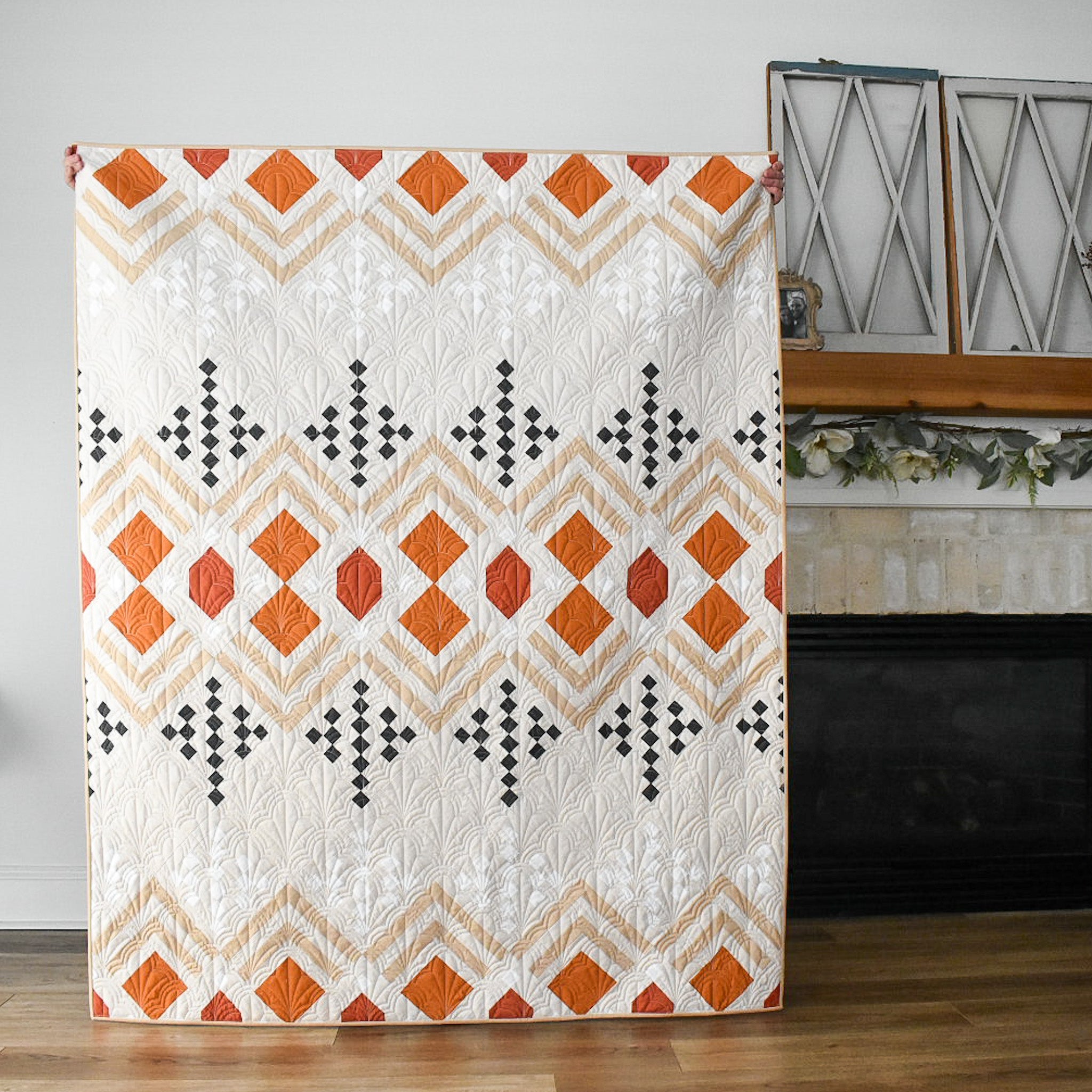
The next stop on our Deco Pattern release train is my Ivory Deco quilt!
In case you missed it, the Deco Quilt pattern is now available!
If you haven't already read my initial blog post about the two-color Deco quilt that I made, be sure to check that out here. You'll find my inspiration, pattern sizes fabric requirements and other details about Deco.
This particular Deco quilt was my second iteration of the design. While my first Deco used two colors, I always knew that I wanted to find a way to introduce more colors into the quilt. I began to experiment with how different fabric groupings within the quilt can change the overall appearance of the design. In my many hours of playing around with different combinations, I noticed that there were certain trends that I was gravitating towards. I think this is apparent in my mock-ups in the pattern and the different Deco quilts that I've created.
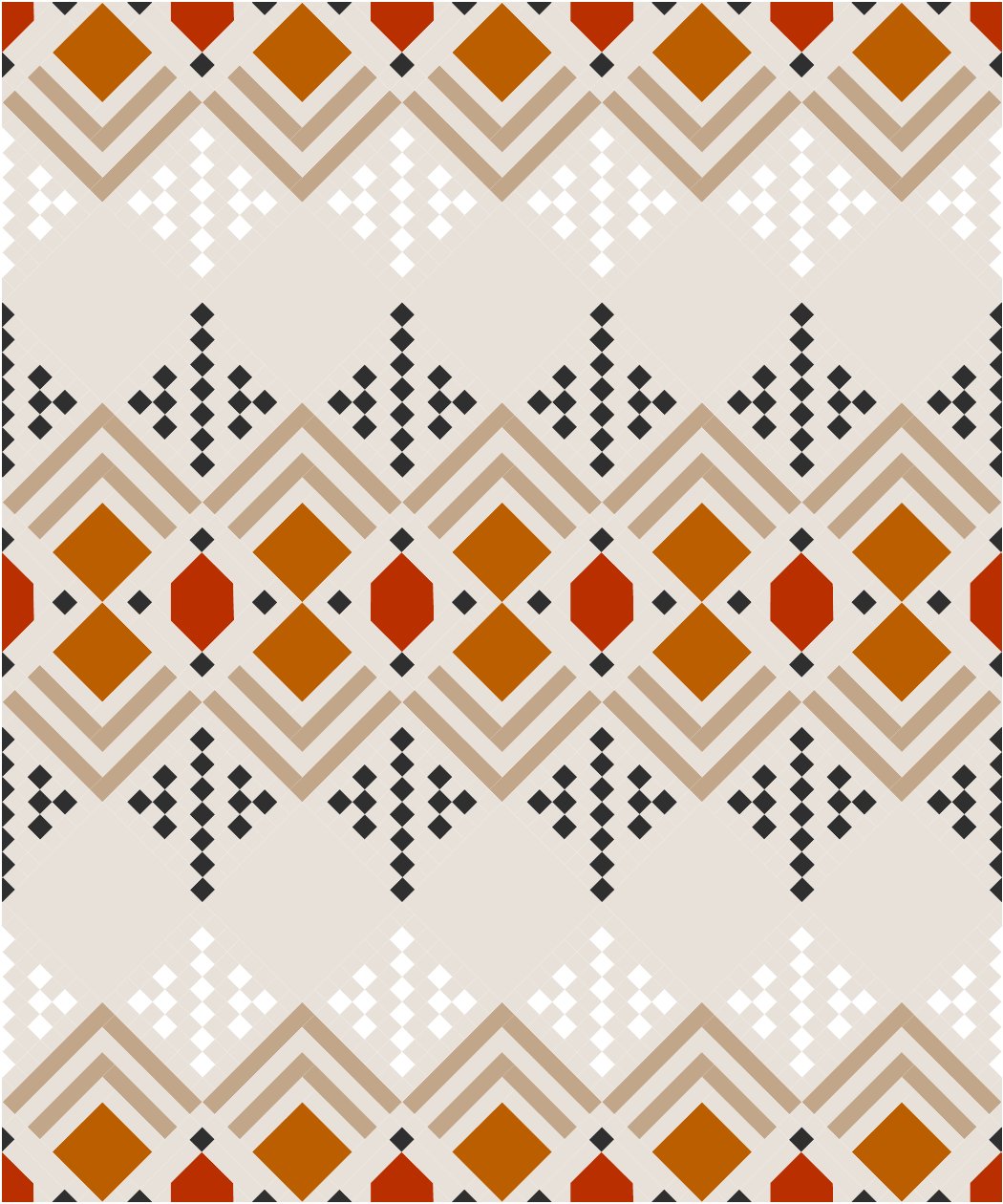
Ultimately, I wanted the center of the quilt to radiate outward and have a "glow" to it. This lead me to choose Color 1 (red), Color 2 (orange) and Color 4 (dark grey) so that they had a similar value or saturation level. Then Color 3 (the strips of the log cabin) had a medium value, which help gives that radiation appearance...almost like rays from the sun. I noticed that if Color 3 was darker than Colors 1 and 2, then the quilt looked very "chevron-y" which isn't really want I'm going for. You can see what I mean in the mock-up below. It's not a bad option....it just puts the focus on the quilt in a different area.

.
Color 5 represents the dots at the top and the bottom of the quilt. I briefly debated leaving those blocks as Color 4, but I really liked the thought of using a low volume color, to make them appear as an echo or afterthought. This softens the design a little bit and doesn't make everything so "in your face." It also adds another element of interest and an opportunity to introduce more color. You can see in the mock-up below what the design would look like if Colors 4 and 5 were the same. Again, not bad, but it seems a little bit chaotic. Then the second design shows my final mock-up that I based this quilt on. If you're stumped on how to choose your Color 5, I would consider using something that is somewhat similar to the Background fabric.

.

.
Again, I kind of used this rule of thumb moving forward with all "Modern" versions of Deco, but it doesn't necessarily mean that it's the right way or the only way. There are coloring pages within the pattern....experiment with different ideas either on paper or in a computer program like ReColor or Adobe and see what you think. Let your ideas and creativity run wild!

.
This Deco quilt is actually really special because it was pieced by my new assistant, Kara! She's been with us now for almost 3 months and we have loved having her a part of our little team! She has been helping with sewing, fabric bundles and she might even make a few guest blog appearances. I never thought Lo & Behold would get to a place where it's more than just us...but having help makes me feel about 20 pounds lighter, so I'm very thankful for it! You can find Kara at @hollandhomesteaddesigns!
Okay, back go this quilt. :) I used all Robert Kaufman Kona Solids. They are:
- Color 1: Cedar - 1/2 yard
- Color 2: Terracotta - 1/3 yard
- Color 3: Khaki - 3/4 yard
- Color 4: Gotham Grey - 1/2 yard
- Color 5: White - 1/2 yard
- Background- Ivory - 3.25 yard
We have kits for the quilt top, backing and binding in our shop! You can find it here.
I had Kara snap a few progress photos of the quilt, just so that we could see it come together. I'll be honest, I was a little bit nervous about the Ivory background. In my initial mock-ups, I used White as the background and Ivory as Color 5 (the dots at the top and bottom of the quilt). But ultimately, I wanted to do something a little different and unexpected, and I think stark white backgrounds are overrated most of the time! Once it all came together, I was VERY happy with this decision!

.

.
I had Kara send the quilt top and backing to Ashley of Hen House Quilting again. She had lots of suggestions for me, like always, and we ended up using "Clam Glam - Deco" by Karlee Porter. I love how the curves offer some movement and playful-ness in this quilt! It feels less harsh than my previous version...yet it's still very "deco". Ashley used an Ivory color thread to blend in with the background color, which is normally what I prefer.

.
For the backing, I use Trouvaille Routes Sparkler by Art Gallery Fabrics. I really love play with lines in this fabric! For the binding, I went with Kona Khaki....nothing too bold. :) I don't normally choose subtle bindings like this, but I didn't want to choose anything that competed with the more saturated sections of the quilt. I normally love a good accent binding, so this was a change. I wasn't sure about it at first, especially how it looks with the backing, but it's growing on me! I'm coming to the conclusion that not every quilt has to have the same principles....gotta keep things fresh and fun! :)

.

.
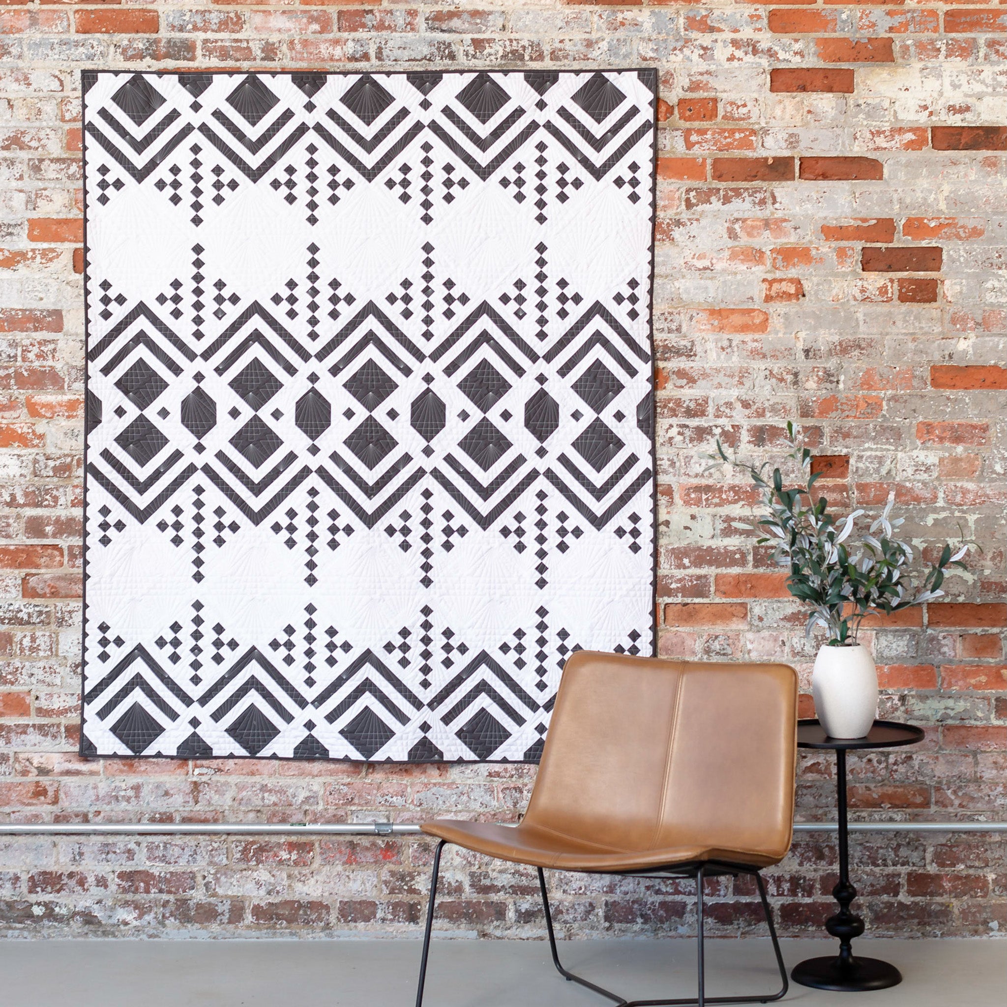
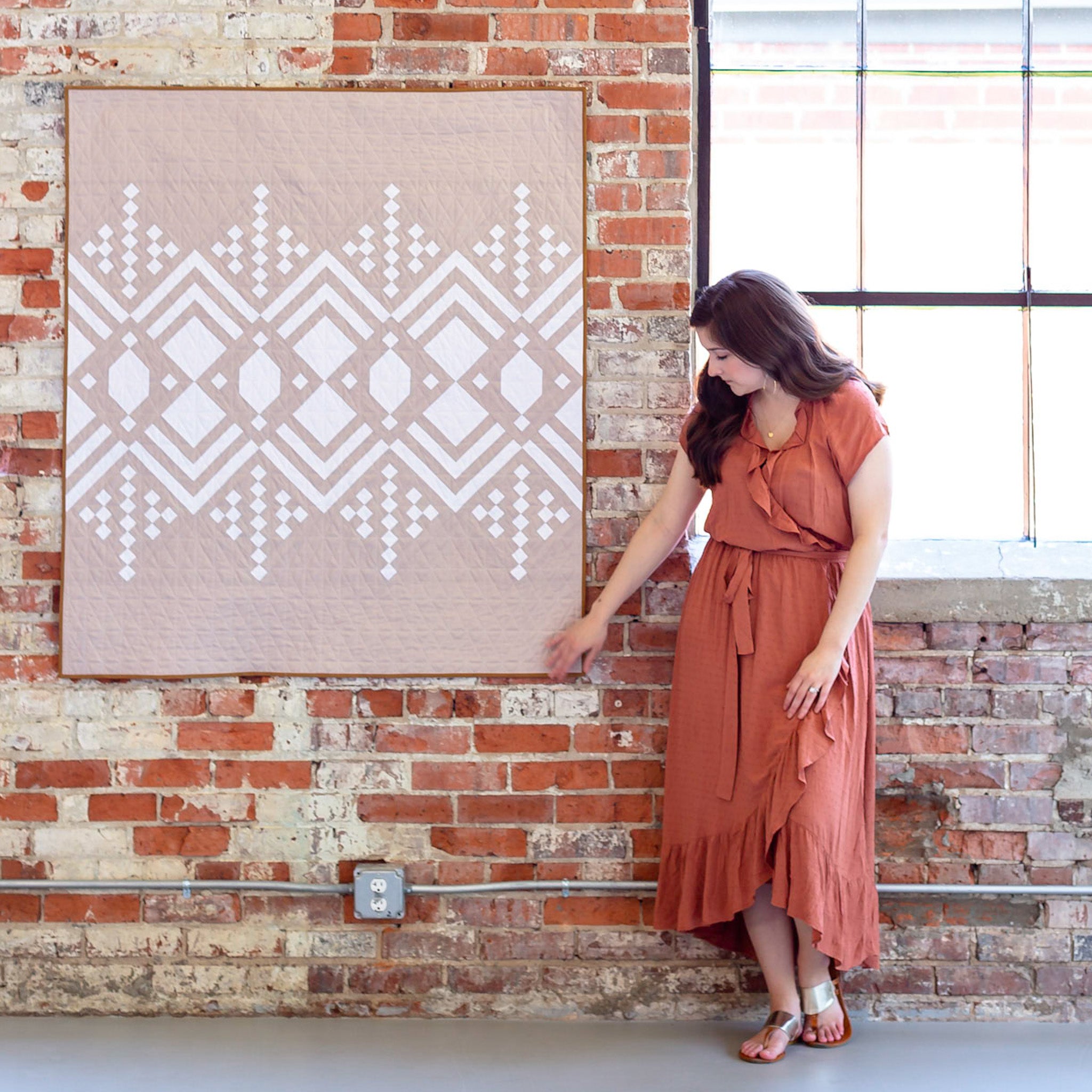
Here are some photos from our photoshoot a few weeks ago with Brittany Pelegrino. I love how this quilt looks with the older brick!

.

.

.

.

.

.

.

.

.

.

.

.

.

.

.

.

.

.

.

.

.

.

.

.

.

I really love how this quilt turned out! It was a fun, group effort, which I'll cherish forever!
I'll be back tomorrow with another Deco quilt to show you!
LINKS:
- Deco Quilt Pattern - DIGITAL
- Deco Quilt Pattern - PAPER
- Blog Post - the original Deco quilt
- Quilt Kits


